Groningen Gas
Visualization of quakes created by gas extraction in Groningen.
Visuals and Audials
Visualization of quakes created by gas extraction in Groningen.
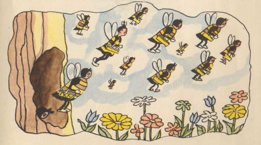
Van alles over bijen (van 8 tot 88 jaar).
An interactive visualisation. Work in progress.
(voorheen op allesoverbijen.nl).
How a triosonata is structured, with examples.
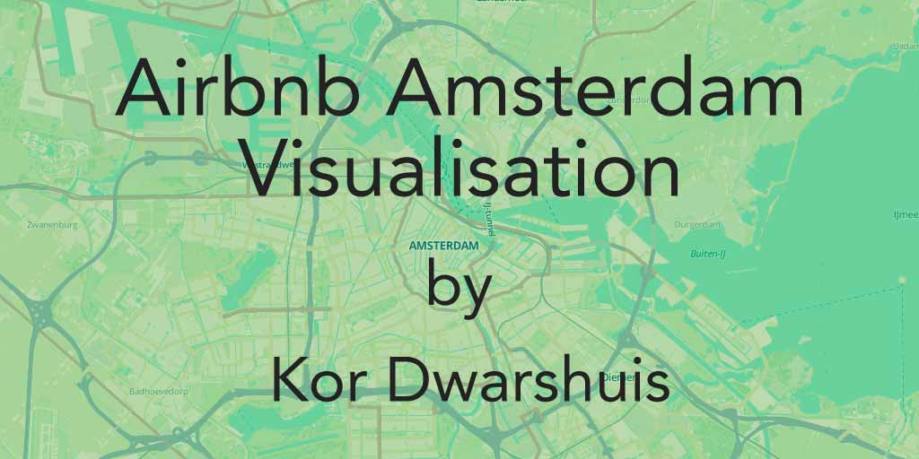
Visualisation of Airbnb Amsterdam through the years.
Visualisation of Airbnb Barcelona through the years.
Meldingen van wolven en andere jachtdieren die huisdieren doden (2017 – 2025). Een interactieve visualisatie.
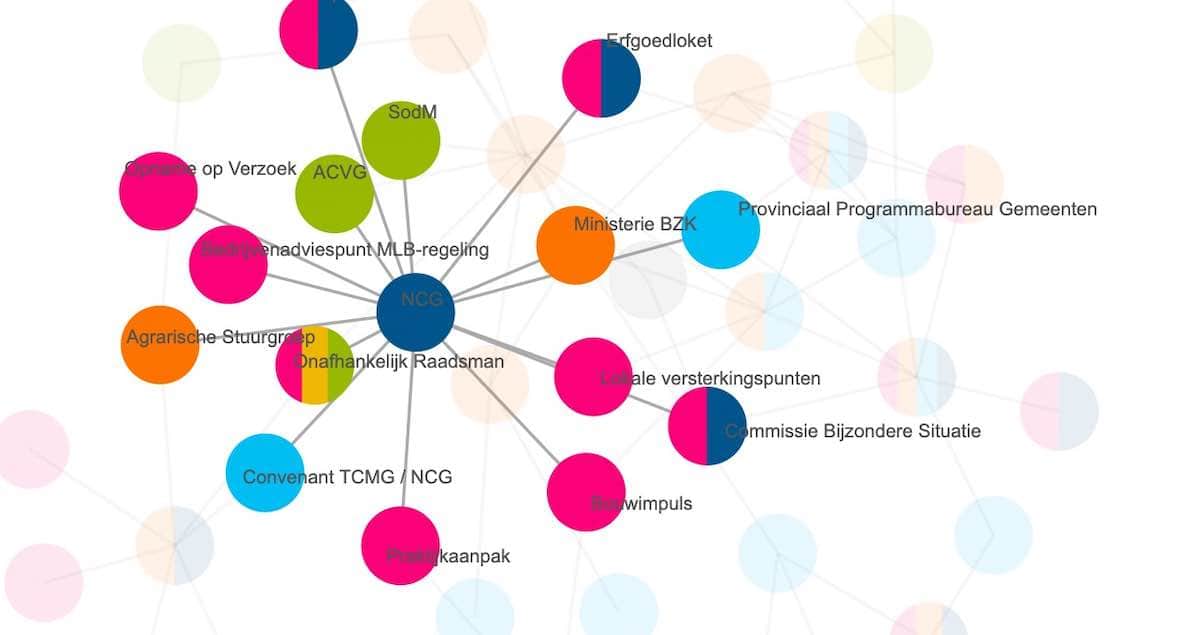
Organisations around mining damages.
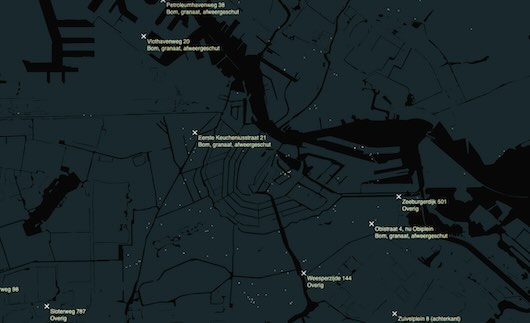
Visualisation of Bombings Amsterdam in WW II
“This Week’s Top Data Journalism. Dwarshuis illustrates the Airbnb phenomenon in Amsterdam since the company launched.”
“Graphic designer Kor Dwarshuis created a visualization showing chronologically the growth of the number of newly registered Airbnb properties in Amsterdam (translated from Dutch).”
The Next Web: “But in the past year or so, that stance has completely reversed – and thanks to this visualization by Dutch data visualizer and animator Kor Dwarshuis, it’s not hard to see why.”
Train your memory
Kerstkaart 2021.
Kerstkaart 2022.
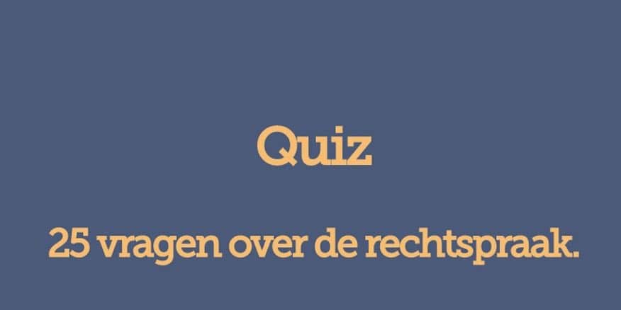
25 vragen over de rechtspraak.
The Guardian's project about people killed by police in the US in 2015 – 2016